Fusedash vs StatPecker
Side-by-side comparison to help you choose the right product.
Fusedash continuously transforms raw data into clear dashboards so your team can act and improve.
Last updated: March 4, 2026

StatPecker
StatPecker transforms your data into instant, stunning visuals and insights, empowering smarter decisions effortlessly.
Last updated: March 1, 2026
Visual Comparison
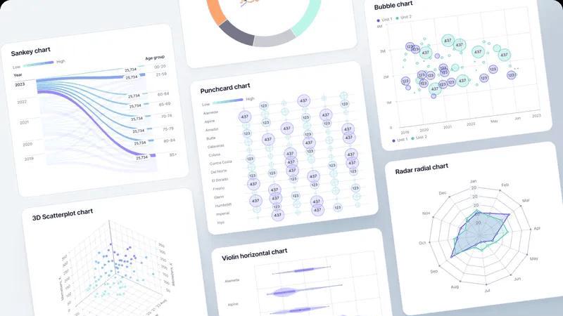
Fusedash
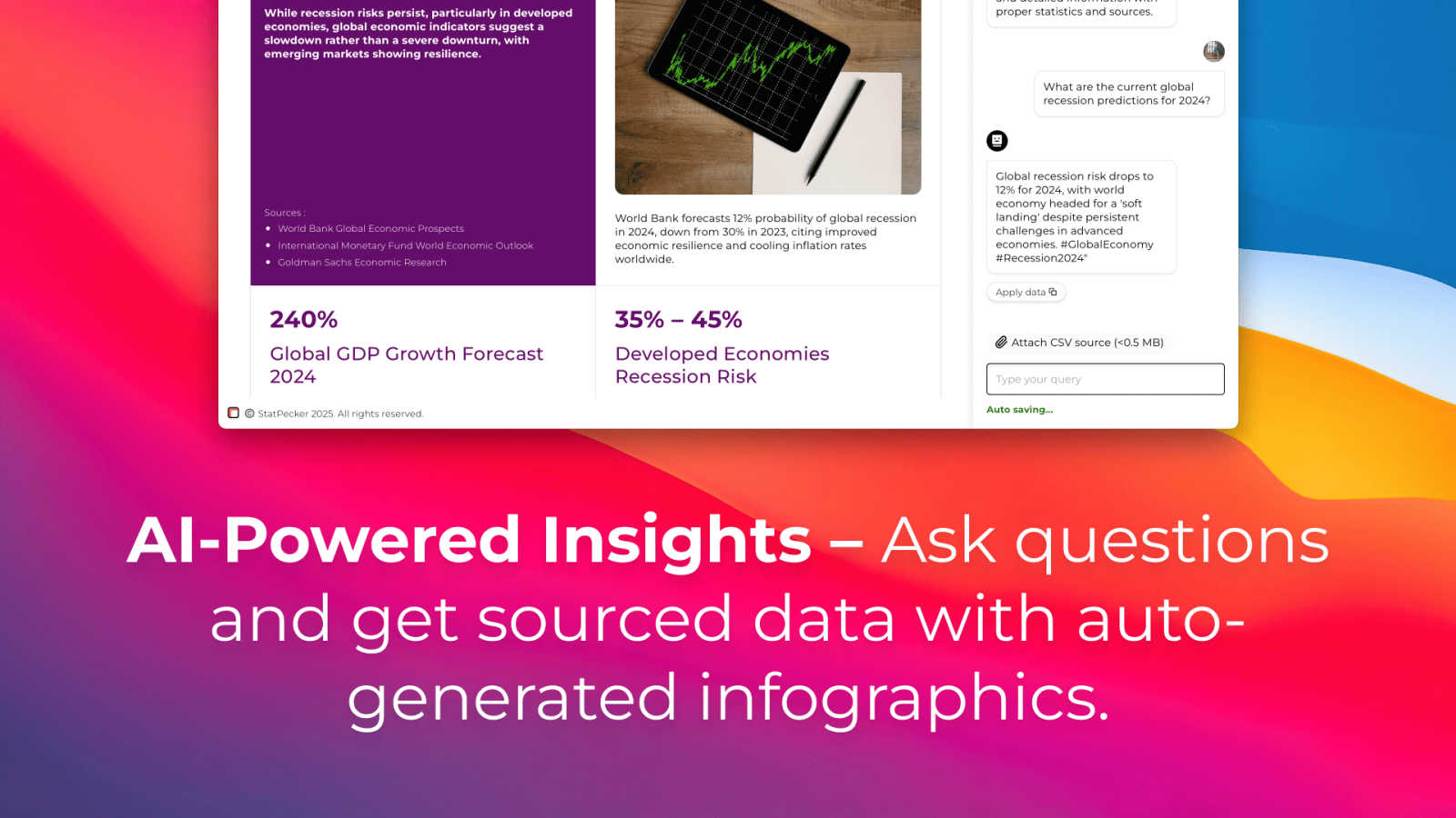
StatPecker
Feature Comparison
Fusedash
Unified AI Visualization Workspace
Fusedash consolidates the entire data storytelling workflow into one cohesive environment. Instead of juggling separate tools for dashboards, charts, maps, and reports, teams can build all these views from the same connected dataset. This eliminates redundant work and ensures consistency. You can start with a standalone AI-generated chart for a quick insight and then seamlessly incorporate it into a broader, real-time monitoring dashboard or a detailed narrative report, creating a continuous loop of insight generation and sharing.
AI Chart Generator
This feature accelerates the initial step of data exploration by allowing users to generate clear, effective visuals from their data in minutes. Simply upload a CSV or connect an API, and use AI assistance to pick the optimal chart type, apply relevant comparisons, and refine labels. These charts serve as foundational building blocks that can be iteratively improved and reused across multiple dashboards and reports, ensuring visual consistency and saving significant time in the report-building cycle.
Contextual Storytelling & Reporting
Fusedash recognizes that dashboards alone often lack narrative context. Its storytelling feature allows teams to combine performance charts and KPIs with written analysis, annotations, and insights. This creates a complete, decision-ready report that explains not just what changed, but why it matters and what the proposed next steps are. This iterative reporting process reduces misalignment and ensures that every data presentation drives toward actionable conclusions and continuous strategic refinement.
Smart AI Data Chat
Embedded directly into the platform, the AI Chat function acts as an always-available data assistant. Users can ask questions about their data in plain language, explore breakdowns by segment or region, and receive intelligent suggestions for relevant metrics or visualizations. This feature democratizes data access, allowing non-technical team members to engage in an iterative exploration cycle, turning their questions directly into shareable, interactive views that fuel ongoing analysis and discussion.
StatPecker
Ask Your Query
StatPecker allows users to obtain instant insights from validated sources using intuitive AI technology. Simply ask your question, and the platform generates relevant visuals without the need for complex tools. This feature simplifies the data exploration process, making it accessible to users at all skill levels.
Publish & Embed
With StatPecker's publishing capabilities, users can make their visuals interactive and effortlessly integrate them into various platforms, including blogs, articles, and websites. This feature ensures that your data stories reach a wider audience and maximize engagement.
Upload & Analyze CSVs
This feature enables users to upload local CSV files of up to 50 MB and extract key insights without the hassle of traditional spreadsheet programs. StatPecker performs on-device analysis, ensuring data privacy while providing rapid, insightful visualizations based on user queries.
Download & Use Anywhere
StatPecker allows users to export their infographics as high-quality images suitable for reports, presentations, or any other application. This flexibility ensures that users can utilize their data visualizations across different media, enhancing the overall impact of their storytelling efforts.
Use Cases
Fusedash
Streamlining Executive & Board Reporting
Leadership and board members need a consistent, high-level view of organizational health without getting lost in data noise. Teams can use Fusedash to build a centralized executive dashboard with defined KPIs, which is then used as the single source for all reporting. The storytelling feature allows analysts to add monthly commentary and context directly alongside the charts, creating a polished, narrative-driven report package that evolves each cycle, ensuring leaders always have the latest, most coherent story.
Unifying Marketing Campaign Analysis
Marketing teams often pull data from numerous platforms (social, web, email), leading to fragmented analysis. With Fusedash, they can connect all data sources into one workspace. They create a master dashboard for real-time campaign monitoring, use the AI chart generator for quick ad-hoc analysis of specific channels, and employ storytelling to compile weekly performance reports that highlight wins, learnings, and iterative adjustments for the next campaign cycle, keeping the entire team aligned.
Operational & Regional Performance Monitoring
For operations or sales teams managing multiple locations or regions, Fusedash's mapping and filtering capabilities are essential. They can build an interactive map view to monitor KPIs like sales volume or support tickets geographically. Drilling down into a specific region reveals a tailored dashboard for that area's manager. This creates a continuous feedback loop where national trends and local insights inform each other, driving iterative improvements across all operations.
Democratizing Data for Non-Technical Teams
Departments like HR, Finance, or Customer Success may rely heavily on analysts for reports. Fusedash's AI Chat and reusable dashboard templates empower these teams to ask their own data questions and access pre-built, trustworthy views. A customer success manager can quickly check client health scores, or an HR business partner can track hiring funnel metrics, fostering a culture of self-service, data-informed decision-making that improves iteratively as teams learn what metrics matter most.
StatPecker
Content Creation
Content creators can leverage StatPecker to quickly transform statistical data into captivating visuals that enhance their articles and blogs. By streamlining the data visualization process, they can focus on crafting narratives that resonate with their audience.
Marketing Analysis
Marketers can utilize StatPecker to extract trends and insights from campaign performance data, presenting their findings through visually engaging infographics. This feature helps in making data-driven decisions while effectively communicating results to stakeholders.
Academic Research
Educators and researchers can harness StatPecker for visualizing complex datasets in their studies or presentations. The platform enables them to create impactful infographics that simplify intricate information, making it more digestible for students and peers.
Business Intelligence
StatPecker serves as a valuable tool for analysts in the business sector, allowing them to generate quick, credible insights from company data. By facilitating the visualization of key metrics, users can make informed decisions and share findings with team members effortlessly.
Overview
About Fusedash
Fusedash is an AI-powered data visualization platform designed to break the cycle of manual, inconsistent reporting and empower teams with a single source of truth. It acts as a unified workspace where organizations can connect their data once—from CSVs, APIs, or databases—and then continuously transform it into clear, actionable insights. The platform is built for teams tired of conflicting data stories and rebuilding the same logic across disconnected tools like spreadsheets, basic chart builders, and presentation software. Its core value proposition is consistency and efficiency: you define your key metrics and KPIs once, and then reuse those trusted definitions across every dashboard, chart, map, and narrative report. This iterative approach ensures everyone, from leadership to marketing to operations, is aligned on the same numbers, fostering trust and enabling faster, data-driven action. Fusedash goes beyond static monitoring by integrating AI features like natural language data chat and smart visualization assistance, making data exploration an ongoing, accessible process. It turns raw data into a dynamic, shared asset that drives continuous improvement, helping teams not only see what's happening in real-time but also understand why by drilling down into the underlying trends and segments.
About StatPecker
StatPecker is an innovative AI-powered data visualization platform that revolutionizes the way users transform raw data into dynamic, engaging infographics within seconds. Designed to bridge the gap between intricate datasets and clear, compelling storytelling, it eliminates traditional challenges such as time constraints, high costs, and the need for technical expertise. StatPecker empowers a diverse array of users—ranging from content creators and marketers to analysts and educators—to generate professional-grade visuals instantly. Its core value proposition lies in its iterative and cyclical approach to data insights: users begin with a query or by uploading a CSV file, receive immediate visualizations, and can continuously refine these outputs to better align with their narrative needs. This ongoing cycle of creation and enhancement ensures that every infographic, chart, and graph serves as a powerful communication tool. By prioritizing agility in data storytelling, StatPecker makes sophisticated visual analytics accessible to everyone, removing the reliance on manual design processes or costly software solutions.
Frequently Asked Questions
Fusedash FAQ
What types of data sources can I connect to Fusedash?
Fusedash is built for flexibility in your data integration cycle. You can start immediately by uploading CSV or Excel files. For live, updated data, you can connect directly to various business applications via their APIs. The platform is also designed to combine multiple datasets—like your internal sales data with public demographic information—into a single, coherent view for richer analysis, all within the same iterative workspace.
How does Fusedash ensure data consistency across reports?
Consistency is a core, cyclical principle of Fusedash. You define your key metrics, calculations, and business logic (like "Monthly Recurring Revenue" or "Customer Churn Rate") centrally in the platform as reusable data models. Whenever you or a colleague builds a new dashboard, chart, or report, you select from these pre-defined metrics. This guarantees that every view across the organization calculates numbers the same way, creating a single, evolving source of truth.
Is the AI Chart Generator suitable for complex data analysis?
Yes, the AI Chart Generator is designed as a starting point for both simple and complex datasets. It assists in the iterative process of visual exploration by recommending the most effective chart type for your data structure (e.g., time series, comparisons, distributions). You maintain full control to then apply filters, add comparisons (like month-over-month growth), and refine the visualization, making it a powerful tool for accelerating the initial insight discovery phase before diving deeper.
Can I share dashboards and reports with people outside my company?
Absolutely. Fusedash provides secure sharing options to support collaborative and client-facing cycles. You can generate shareable links to interactive dashboards or export polished, narrative reports as PDFs or presentations. You control the access level, allowing you to disseminate insights to external stakeholders, clients, or partners while maintaining the integrity and consistency of the data story you've built.
StatPecker FAQ
How does StatPecker ensure data privacy?
StatPecker employs on-device analysis for CSV uploads, meaning that your data remains secure on your device during processing. This approach guarantees that sensitive information is not transmitted or stored on external servers.
Can I use StatPecker for free?
Yes, StatPecker offers a Free Tier that includes unlimited projects, embeds with manual edits, and a limited number of AI queries and CSV uploads. This allows users to explore the platform without any financial commitment.
What types of files can I upload to StatPecker?
Users can upload CSV files of up to 50 MB in size. This capability allows for the analysis of substantial datasets, enabling users to extract meaningful insights efficiently.
How can I export the visuals I create?
StatPecker allows users to export their infographics as high-resolution images that can be used in reports, presentations, or shared across various platforms. This feature enhances the versatility of the visuals created within the platform.
Alternatives
Fusedash Alternatives
Fusedash is an AI-powered data visualization and business intelligence platform. It helps teams transform raw data from various sources into clear, actionable dashboards and reports, creating a single source of truth for the entire organization. Users often explore alternatives to find a solution that aligns perfectly with their unique needs. This search can be driven by factors like budget constraints, the need for specific integrations, or a desire for different feature sets. The goal is to find a tool that fits seamlessly into their existing workflow and data ecosystem. When evaluating options, consider how a platform ensures data consistency and reduces manual effort. Look for a solution that empowers continuous improvement by making insights accessible and actionable for everyone, not just data specialists. The right tool should evolve with your team's growing analytical maturity.
StatPecker Alternatives
StatPecker is an innovative AI-powered data visualization platform that transforms raw data into engaging infographics quickly and efficiently. As a dynamic tool in the analytics and data category, it caters to users looking to bridge the gap between complex datasets and clear storytelling without requiring extensive technical skills. Users often seek alternatives due to various reasons, including pricing concerns, specific feature requirements, or compatibility with their existing platforms and workflows. When choosing an alternative, it's essential to consider factors such as ease of use, the ability to integrate with other tools, and the flexibility to adapt to different data types and visualization needs.